Frame-by-frame animation is a very simple practice of CSS3 animation. But these days lots of friends asked me some questions such as how to make a frame-by-frame animation by using CSS3? Why not use gif pictures? We already have gif pictures, why do we need CSS animation?
So in this blog, I want to briefly talk about how to make frame-by-frame animation, and its advantages.

(2) Gif picture can't do interaction with users
For example, we all have used microblog, if we put our mouses on the static picture, it will show the dynamic picture, but if there is a dynamic picture and we want to let it stop when mouse is over it. Can gif do this? No. Can CSS do this? Yes! Let's look at the following instance, just put your mouse over the walking man, it will stop.(Please see this effect in PC end)
Ok, too much. Let's talk about how to do this effect.
2. Do the effect!
(1) Preparation. We need a sprite picture like below, if you want to draw a walking man using CSS3/Canvas, it's your choice, but here I only want to show the most common and simple way.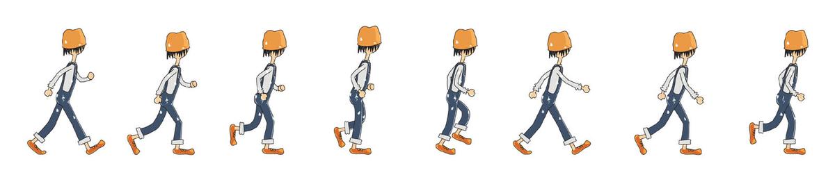
(2) Then, we should use "background-size" and "background-position" to control the visible parts. And use "animation" to do the effect, there is a attribute named "step" to control frame-by-frame animation.
.testImg {
display: block;
width: 100px; height:150px;
background: url(xxx.jpg) 0 0 no-repeat;
background-size: 750%;
animation: testImg steps(8, start) 1.2s infinite both;
}
@keyframes testImg {
0% {background-position: 0%;}
12.5% {background-position: 14.5%;}
25% {background-position: 28.5%;}
37.5% {background-position: 41%;}
50% {background-position: 54%;}
62.5% {background-position: 67%;}
75% {background-position: 83%;}
87.5% {background-position: 98%;}
}
Done? Can you find any questions? If you use the same codes like above, you will get the following effect:
How could it be? Actually, the default animation method is continuous animation, so we should set its changing period and staying period. Let's change the animation codes together. (We should set the pre-end time is a little bit smaller than next-start time)
@keyframes testImg {
0%, 12.4% {background-position: 0%;}
12.5%, 24.9% {background-position: 14.5%;}
25%, 37.4% {background-position: 28.5%;}
37.5%, 49.9% {background-position: 41%;}
50%, 62.4% {background-position: 54%;}
62.5%, 74.9% {background-position: 67%;}
75%, 87.4% {background-position: 83%;}
87.5%, 100% {background-position: 98%;}
}
(3) Mouse-over-stop effect
The key is how to stop the effect? Just think about it. Which is related to control the animation? "animation-play-state"! We should add "mouseover" and "mouseout" events to the image, when the mouse is over the picture, we should set the "animation-play-state" be "paused". Things done!